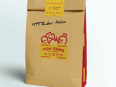
Foh Sang E Market - Packaging Design
[Packaging Design]
E Market Foh Sang Project Initiated by YB Ginger Phoong 〰 We were tasked by YB Ginger Phoong to design the first Electronic Market (E-Pasar) visual identity for Foh Sang two days ago. This is being setup to replace the closure of the morning market in Foh Sang. This solution can help both hawkers to solve their livelihood problem on one hand; and provide convenience for residents on the other, thereby achieving a win-win for both consumers and hawkers.
Concept of the logo The concept was inspired from the vintage price label that we often see on products sold in Malaysia. Along with the combination of fresh groceries behind of the label. The interesting layout shows the idea of selling fresh groceries in a straightforward way. Customize Chinese typeface was made for the logo too.
