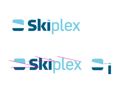
Skiplex - Indoor Endless Slope Ski Logo
First concept for Skiplex, an indoor skiing centre that operates on an endless moving slope, imagine a running treadmill, but much bigger.
Watch a video of Skiplex in action.
The client mostly wanted a clean wordmark, using the Facebook logo as an example of the general style he wanted. At the time it was agreed that we would not create a logomark, but this has since changed.
It was because of the general cliche nature of many skiing logos that we first looked at a strong wordmark.
First step was to look at a large variety of fonts until I narrowed down the choice to just two pairs. The one you see being the font combo that felt right to me. From this I then customized the S and K considerably. I played with a variety of subtle type styles, angles and cut offs, trying to create something 'ownable' but not too obvious.
Showing the the two font styles that I used to make the hyrbid S and K sitting underneath.
About half way through I decided to look at a logomark, even thought it was not requested. Figured I would spend a day playing, and if something came to mind, great, if not, then great again. I zeroed in on this block, playing with negative space to form the Skiplex slope, open ended to give the impression of 'endless', no start or beginning. The space carries on into the S. From there we have a set angle, which I then used to carve out the top of the 'k', the bottom of the dot on the 'i' and the p and l. The negative space between the k and i forms the same angle as in the logomark.
Using the colours, I also hint at blue sky within the mark and the dot on the i is just a smaller version of the the top portion of the logomark. The magenta lines show where I have focused on creating equal and consisten angles.
The outside curve radius of the container also matches the radis of the curves on the 's', so although not obvious or immediately apparent, there is some cohesion between the logomark shape, mimicking a portion of the 'S'
A few photos with the logo on, reversed in solid white.
Given this will be used to brand the Skiplex centre as well as being used to embroider staff shirts and other usual marketing materials, the whole logo has to be quite clean and simple, but I hope that with the thought that has gone into this, shows that simple can still be functional and not tacky.
However, during my sketching it became apparent that a logomark could actually be devised that was not cliche or tacky, but that also created visual associations to skiing and skiplex.
Spacing needs to be opened up I think the letters are too tight, especially at smaller sizes.
