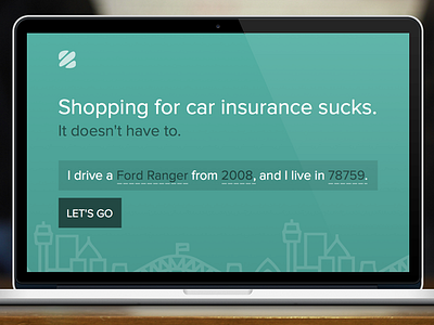
plainass homepage
Working on a new, ridiculously plain homepage for InsuranceZebra. I doubt I'll end up doing it in green, just wanted to give it a stab as I get started. Attached is a full-size of what I've got done so far, all of which is likely going to change.
The city lineart at the bottom was nabbed from @scottysimpson, and of course will be swapped out before I finish for realsies.
More by Clark View profile
Like

