UI/UX update
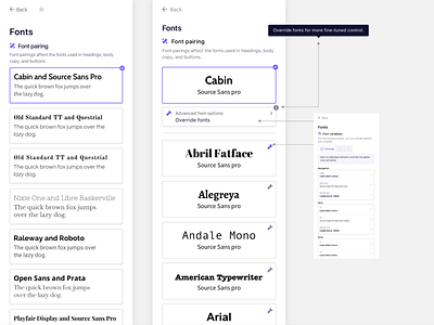
One of the projects I have been working on at B12 is updating the UI/UX of how the product handles fonts. Here is a side by side view of a before and after of how I have adjusted the experience to be more user friendly.
Here is a list of some of the adjustments:
-Made the selected font more clear to users at the top of the pane
-Only show the two fonts being used to be able to scan the fonts quicker (as well as understand the hierarchy of the fonts)
-Made the section alphabetical in order to find the particular font they are looking for easier (our current experience does not have a particular order which makes it hard to find fonts when you are looking for something specific)
-Made the "advanced font options" at the top of the page in order to help users find this feature easier
-Added “the advanced font options” icon to each of the pairings in order for users to be able to edit their fonts in one step instead of two.
