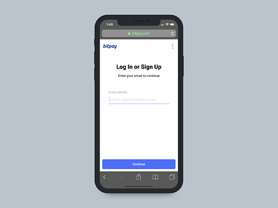
BitPay Personal Account Onboarding - Mobile
What’s up guys,
This is another major product that we launched last summer. Up until then, we had a fully segmented account system. Businesses got business accounts and debit card users got card accounts. With BitPay ID, we wanted to consolidate and pave the way for an immersive consumer ecosystem. To do this, we needed a brand new onboarding system that funneled users accordingly and incorporated KYC when applicable.
This was an extremely challenging and fun project that served as my first real confrontation with the balance of aesthetics and experience. At inception, the idea was to create a barebones, minimalistic login flow with single-purpose states. We were confident that by isolating users by their email, we could conveniently funnel users based on their status.
Stylistically, there were some key restraints: we wanted to definitely use a Material theme to stay consistent with the input fields in our Wallet; additionally I generally avoided graphics or illustrations to reduce dependancies. Avoiding graphics ended up being the right call for this iteration however, I believe flat material inputs are not well suited to a desktop experience; on mobile they feel great (like writing on lined paper).
There was 1 distinct disadvantage to the single-purpose style that was not immediately obvious; we changed the optimal clicks for login from 1 to 2 (assuming password manager in use). In retrospect, this style of login works best when managing multiple accounts (ex. Google). Looking forward, key lessons here is to keep things predictable. Forms don’t need to be smart; they just need to work.
Check it out @ https://bitpay.com/id/verify?dest=fromWebsite


