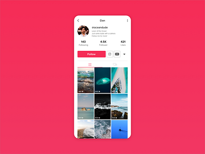
Daily UI #06 - User Profile - TikTok Redesign
Today I'm doing a redesign of the TikTok profile page, to do this redesign I had to download TikTok myself. I don't own the app myself, because I feel I'm too old for this stuff. The text of the profile page is completely centered in the app and too much space is wasted at the expense of the content.
For this reason I tried to give the content more space again and keep the texts left-aligned.
More by Justin Switalla View profile
Like
