Eman Montenegro
“Simplicity is the ultimate sophistication” - a wise man once said. While we’re not nowhere near DaVinci’s genius, we are pretty good at making beautiful foundations for the upcoming businesses.
Our client from the export-import world had an inquiry of making a logo that would represent close ties between those two branches. Also, it was supposed to be a token of Italian/Montenegrin relationship, since its consumer goods come from the cradle that have spawned DaVinci in the first place.
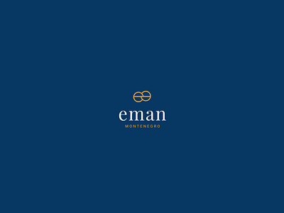
Enter - Eman Montenegro. Or how we see it - eman MONTENEGRO.
Our designers came up with a combination mark of unorthodox lower and upper case letters and intertwined symbols representing aforementioned request from the client.
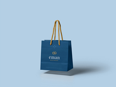
So far, we're good. Logo was created by binding two "e" letters that suggest unity and security. It is solved as a striking form, applicable on all surfaces. Small and the big ones. Typography is solved by using modern serif with the aim of achieving elegance and contrast between the minimalistic form of sign and logotype.
Check out full project here
Show your love by Pressing L for "❤️".
✅ Follow us on: Behance
Tell us about your project and we will get back to you in 24h.
Or 📬 mail us if you need to build something great: info@bild-studio.net


