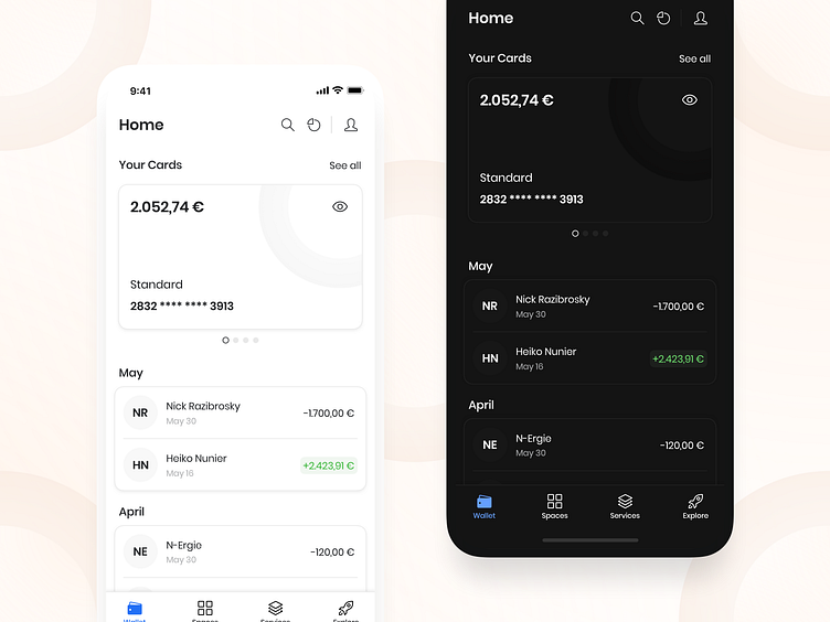
Banking App | Light and Dark Mode
Today I'm back with a small light & dark themed home screen for a banking app.
I focussed on being as simple as possible, while using as little color as possible. I got heavily inspired by the N26 app that I just love, but tried to create my own design out of it and adjust some things (like the card preview).
I'm bored of these super colorful and trendy banking designs, that just make no f*cking sense. What do yu think about this topic?
Are you looking to get your app designed? I'm always keen on creating new experiences with cool companies & startups. Contact me: schneider.uiux@gmail.com
Make sure to follow me and hit the like button when you want to see more designs from me.
More by Julian Schneider View profile
Like
