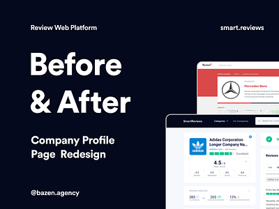
Smart.Reviews - Before & After
Hi guys!
Today we continue with the analysis of the Smart.Reviews project that we have already introduced you to! 🤗
_
About the project: Smart.Reviews
Design by: @TajanaTomic
_
In today's post, we are slowly starting to dive deeper into the challenges we have encountered during the development of this project.
_
What was our main challenge?
_
The client's request was to create a user-friendly but serious design that would allow users to access a large amount of information and reviews about various companies and products. Why was that challenging for us? It was necessary to place a large amount of information in one space, but at the same time achieve harmony, so that all of this does not interfere with the platform's primary function - reading and leaving reviews.
_
How do you like our solutions? ❤️


