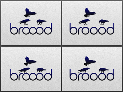
Broood Logo
I'd love to get some feedback on these variations.
- Do the o's need to be separated for better readability?
- Are the birds just floating if they're not anchored to the logotype?
- Should the birds be centered on the o's or between the b and d?
I'd like to use the logomark and logotype in both vertical and horizontal orientations, as well as on their own. How might that influence the answers to the above questions.
Thanks!
More by John Gill View profile
Like

