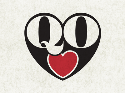
Queen of Hearts
I've been working on simplfying my QOH logo, getting the H in there proved too hard without it looking slightly nazi-esque. It was all too angular and the girl I'm doing this for is too cute for that.
She's a singer so i like how the repetition of the heart in red forms a mouth, kinda like a cartoon bird.
What do you think internets?
More by Message Creative View profile
Like
