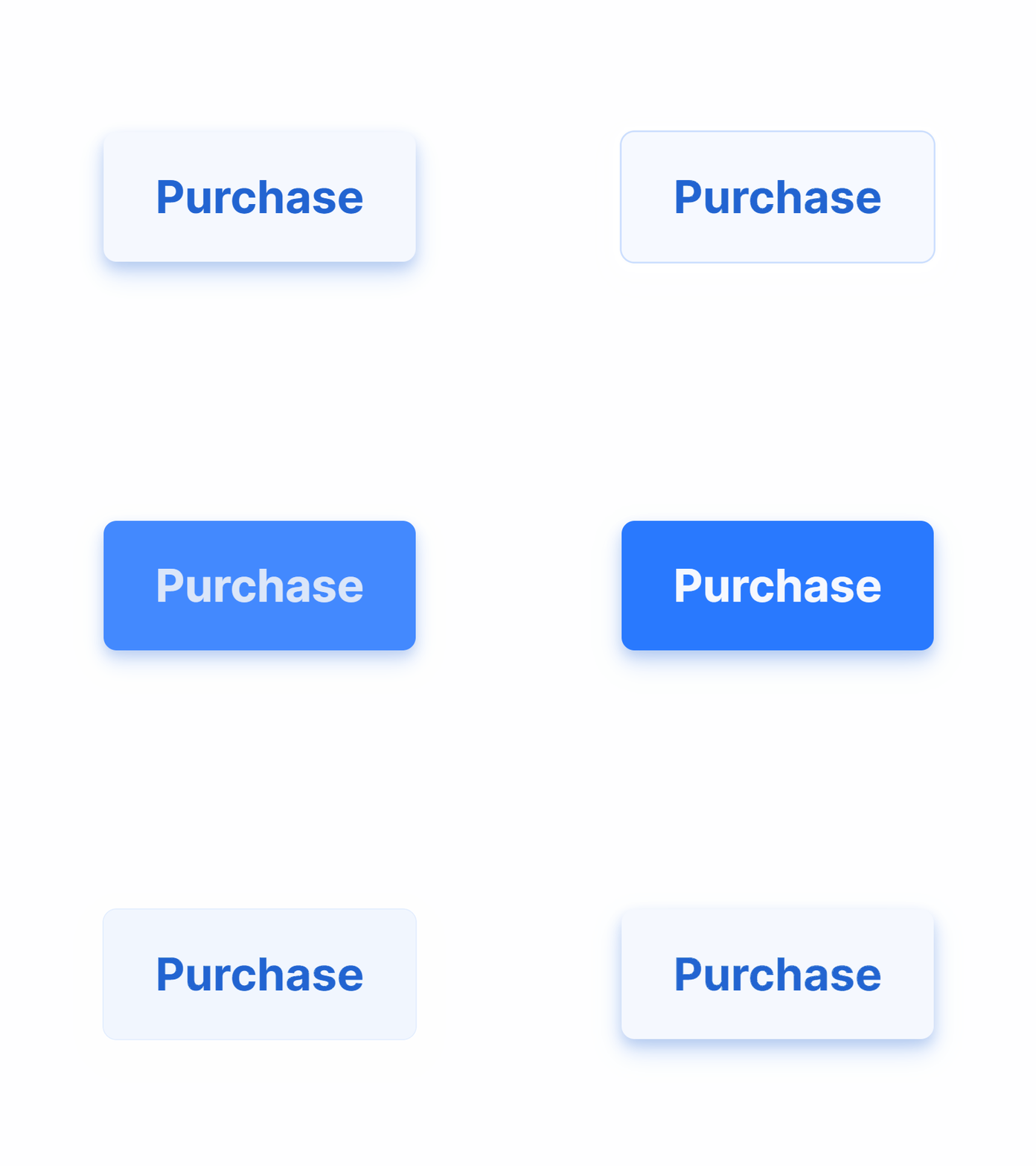
React UI kit - Raised styled components
Raised theme
Shadows are recommended to show the depth in your UI. The elevation is under your control for toggle hovering effect.
React-based UI toolkit for the web. Designed and well-organized in Figma. Optimized for building complex data-dense interfaces for desktop and mobile applications.
Raised theme
Shadows are recommended to show the depth in your UI. The elevation is under your control for toggle hovering effect.
React-based UI toolkit for the web. Designed and well-organized in Figma. Optimized for building complex data-dense interfaces for desktop and mobile applications.
Setproduct Design System Preview.fig
50 MB
More by Setproduct View profile
Like


