Ferris
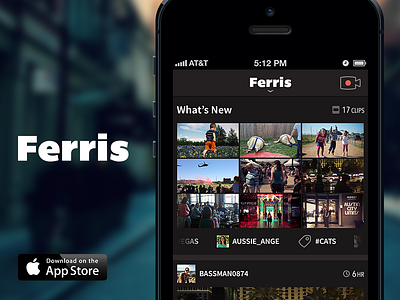
We're very excited to share the work we did on Ferris, a brand new iPhone app that allows users to discover and share life moments through video. We posted the project to our site, where you can read more about our involvement. Ferris is available for free in the App Store, so download and try it out!
Defining the UX and UI for Ferris was a great experience. The Ferris team asked us to explore a "flat" aesthetic, which we delivered while also working in a few elements of depth/layering to bring all of the elements on screen to life. We kept icons thin and bright and the overall tones muted and dark, with punches of color tied to actions and active states. This design was done before iOS7 was announced, so you can imagine how delighted we all were when we saw the new direction Apple had taken and how well Ferris is now set up to adopt the new visual language of iOS.
Be sure to check out the attached jpg, which shows several screens at 100% so you can see the details and how the UI plays out across most of the app.
We're pleased with what we delivered for Ferris and the implementation by their team has been strong. They're working hard on building in updates, new features & improving the app as it reaches the hands of the public.

