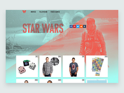
Movie-Tees.com website
While this website is more of a programming experiment for me, I did decide to play with things from a design perspective. I wanted to experiment with two-toned images to create highly stylized images of beloved movies and game. The effect is meant to unify the site as a whole under one style while also paying tribute to the source in a new way. The red slice also plays a secondary role of leading the eye downward to the content below, tying the two together.
More by Rylan Francis View profile
Like
