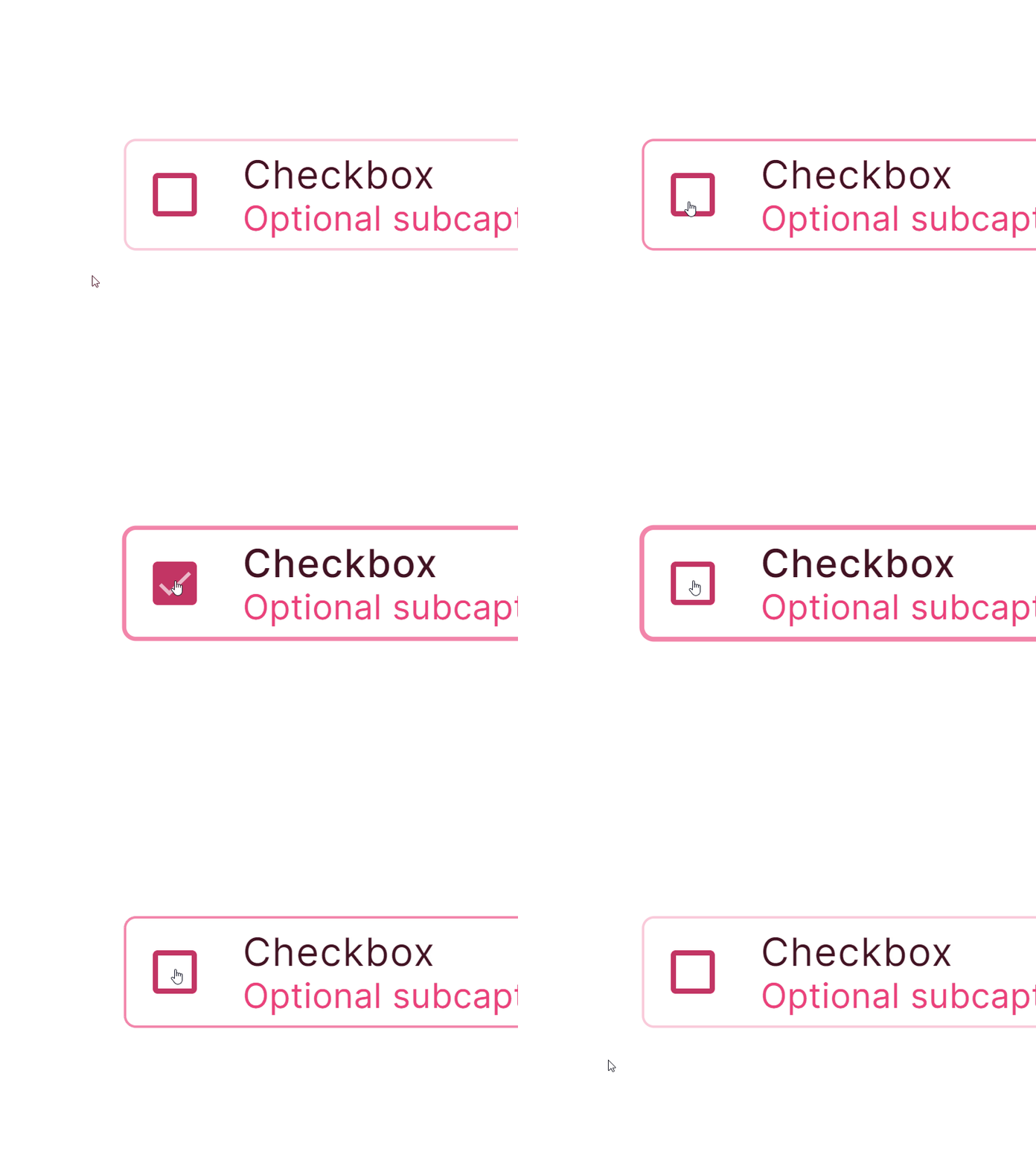
Figma React UI kit - Checkbox component - Outlined style
In Setproduct Design System selected state affects on a border — It grows from 1 to 2px when selected. Thus a user can clarify faster all the selected items.
React-based UI toolkit for the web. Designed and well-organized in Figma. Optimized for building complex data-dense interfaces for desktop and mobile applications.
Setproduct Design System Preview.fig
50 MB
More by Setproduct View profile
Like


