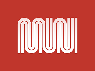
Imagining a new MUNI logo
I think the logo of the San Francisco Municipal Transportation Agency (the "MUNI") is very interesting but I don't like the current proportions. Here's my take on it.
If you don't know how the current logo looks like, check this out: http://en.wikipedia.org/wiki/File:SFMuni_Worm.svg
I also slightly changed the logo's color to match the Golden Gate Bridge's international orange: http://en.wikipedia.org/wiki/International_orange#Golden_Gate_Bridge
More by Stephane Rangaya View profile
Like
