Experimenting with iOS 7
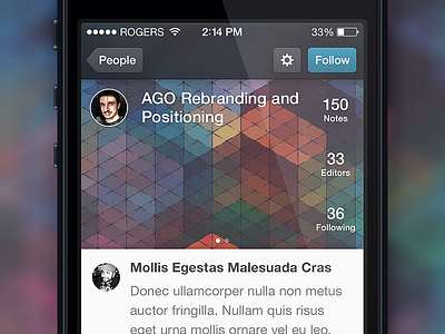
This is not in development or even on the horizon in the near future, but I thought I'd share a screen from Pilot that I mocked up a while ago conforming a bit more to the iOS 7 style; lighter weight fonts, less depth (though not completely void of it) and a few other tweaks here and there. I'm actually quite fond of the status bar being integrated into the navigation bar, but I still think buttons make sense with a border. I have a feeling this hybrid style will be much closer to what non-Apple apps will look like on iOS 7, to prevent them from looking like carbon copies of each other.
As always, check out the real pixels attached and let me know what you think.
More by Evan Dinsmore View profile
Like
