Link Logo


Hello guys, How are you all? Client's Brief: Our company is called Link, we are building consumer tech products and software that make it easier for people to connect with each other and for businesses to connect with their customers/clients. The premise of our products is to share contact information and social media seamlessly.
The logo will be used on our website, app, and products, so we would prefer that the design includes a logomark with text next to it. Our color scheme is mostly black and white, however, the logo should work with any colored background. As I said before, the logomark will be used on our product (which is a rounded square shape) and app icon (also rounded square) so it should fill this space properly.
Solution: They had a logo they were not happy with. The logo was not a perfectly balanced and generic logo. So we got the task to create an entirely new logo.
The client wanted something with an infinite sign. But that symbol is very common in the graphic design industry. So we had to do long research so that it doesn't match any other company logo. To make the mark unique was the main challenge.
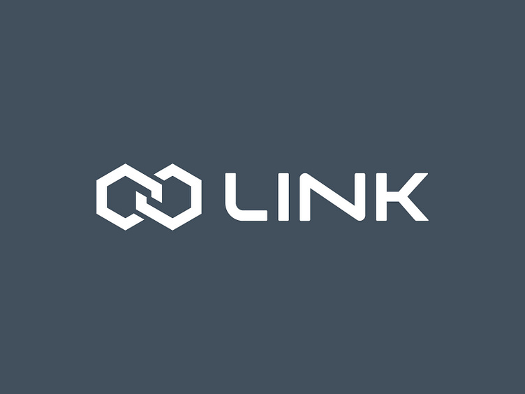
Finally, we came up with a hexagon infinite symbol, which is unique and it has also a feeling of being linked with one another.
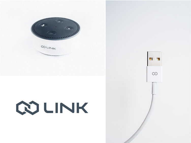
The mock-ups were created just to show the logo feel and real-life perspective. Those are not their real product.
Let me know what do you think about the project. --------------------------------------------------------- For project inquiry email here: brandoxideoffice@gmail.com
Hello guys, How are you all? Client's Brief: Our company is called Link, we are building consumer tech products and software that make it easier for people to connect with each other and for businesses to connect with their customers/clients. The premise of our products is to share contact information and social media seamlessly.
The logo will be used on our website, app, and products, so we would prefer that the design includes a logomark with text next to it. Our color scheme is mostly black and white, however, the logo should work with any colored background. As I said before, the logomark will be used on our product (which is a rounded square shape) and app icon (also rounded square) so it should fill this space properly.
Solution: They had a logo they were not happy with. The logo was not a perfectly balanced and generic logo. So we got the task to create an entirely new logo.
The client wanted something with an infinite sign. But that symbol is very common in the graphic design industry. So we had to do long research so that it doesn't match any other company logo. To make the mark unique was the main challenge.
Finally, we came up with a hexagon infinite symbol, which is unique and it has also a feeling of being linked with one another.
The mock-ups were created just to show the logo feel and real-life perspective. Those are not their real product.
Let me know what do you think about the project. --------------------------------------------------------- For project inquiry email here: brandoxideoffice@gmail.com