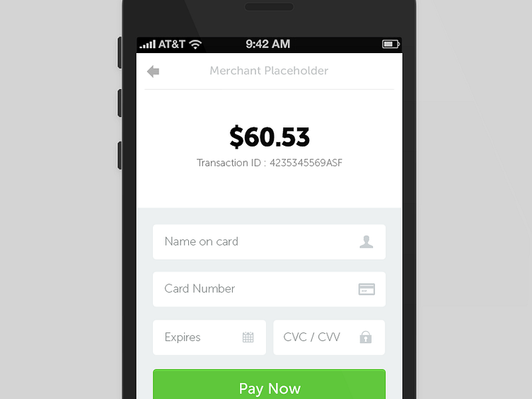
Card Details
Still working on it. The type renders in a much nicer way on device and looks sharp but I am still thinking that increasing weight will be better for accessibility. Couple of other ideas I am working upon -
1. When user taps over the 'Payable amount' that panel flips and shows the order-summary.
2. When user types the card number - It identifies card type and replaces the gray icon on right with an informative Visa/Mastercard/Amex icon as feedback.
More by Nitin Garg View profile
Like
