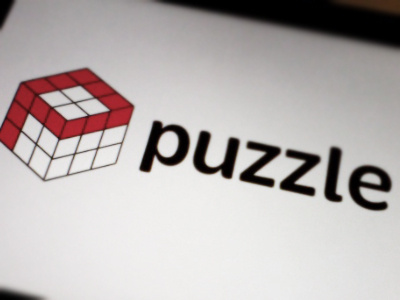
A Puzzling Logo.
Had this idea, so thought I'd try it out. I know that the Rubik's Cube isn't factually correct, colour-wise, but it seemed best that way.
Also - I did a monitor shot - Am I cool now?
More by Conor O'Driscoll View profile
Like
