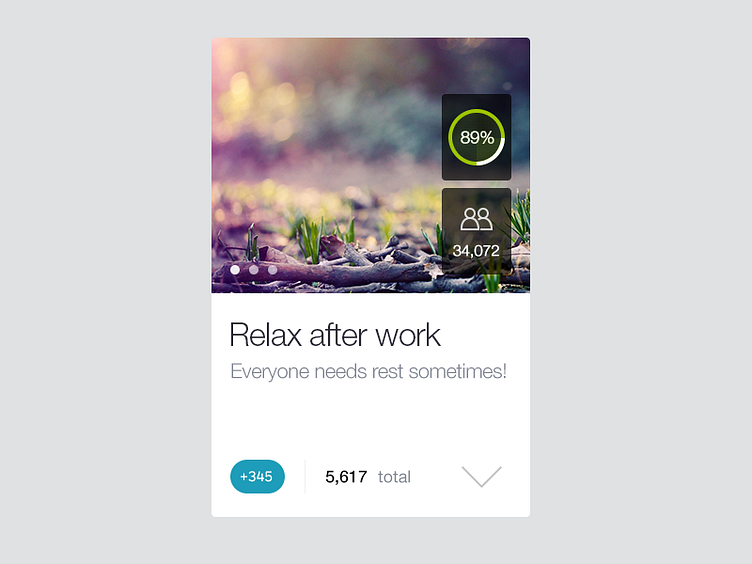
Habit item
Initial concept for habit view on iPhone. The challenge is basically to display a bunch of info and stats on small screen and to allow 2 habit boxes in a row. And to make it all look nice, clean and attractive to the user to encourage him to sign up ;) Personally I also like a certain amount of white space.
The solution I find useful is to use some space on the photo area and allow secondary information to be hidden until the arrow is tapped. You want to know more? Go ahead and click the arrow.
As always some context:
1. Green circle is a progress bar 2. Number of users 3. Title, short description 4. Number of points you gonna get if you complete this habit vs. your current points 5. That arrow
Check out @2x for actual pixels.
*** Tweet, tweet...
