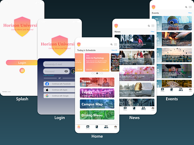
University Concept App (WIP)
I'm looking for some feedback on a conceptual university app that I've been working on. This app aims to create a sense of community by consolidating a variety of functions within a single app, as well as being designed with moduarity in mind for any future expansion.
Current UX considerations:
- When the university assigns the student a university e-mail account, they're also registered for the app.
- Accounts can be linked to external accounts like Facebook, Apple, etc. for easier login processes.
- Each main screen contains 4 main layers: Header (logo, search, and a context-sensitive menu), Subheader (Page title and options text), Content Body, and Footer Navigation. The only exception is the Home section, which has an additional Content Body.
- The Class tab would function like learning platforms (e.g. Moodle, Blackboard, etc.), which means students can view lessons and submit documents from the app.
- The Community tab is meant to serve like a Classiieds section where students can post requests for help, initiate gatherings, or other community functions. I primarily made this with research recruitment in mind, as many universities push for research, but rarely support recruitment efforts.
- Profiles would function similarly to a typical social media profile, but would incorporate 3 different display types: Personal, Friends, and Public.
