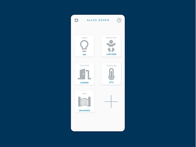
Daily UI 021 (Home Monitoring Dashboard)
This has been my favorite piece to work on. Not because of the challenge but because of the progress I've been making behind the scenes.
Earlier this week, I was feeling a bit down after doing the analytics challenge cos I didn't feel like I was advancing. So yesterday, I picked up the Refactoring UI book and I started reading through and I have learned so much.
Here are some of the lessons:
1. Start with a feature. For this challenge, I started with the ability to see all my devices/items and also hint at a "Add device" feature.
2. Design in greyscale at first then add color. This one was particularly difficult because I love color but I decided to stick with the process and I came up with more content to add because I wasn't particularly hung up on the colors.
3. Every design has a personality and that can be conveyed with color, font typefaces, border-radius etc.
4. Visual hierarchy can be conveyed not just with size but with colors and font weights.
5. Labels are secondary content so you should be sure to de-emphasize them so they don't compete visually with the primary content.
Till tomorrow :)
