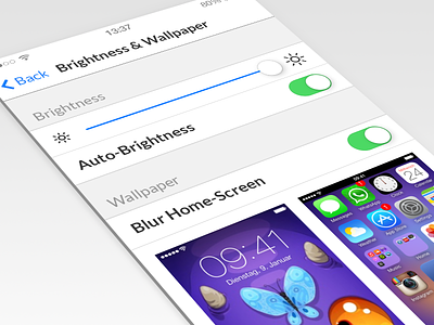
iOS 7 Settings Refined
While playing around with the gorgeous wallpapers http://dlanham.com/art/tea/ by @David Lanham I couldn't resist to refine the new iOS7 settings app a bit. Focus on the necessary by using bold weight in the right place and adding subtle but consistent depth. Fixed proportions of the controls in relation to cell height. And finally: Dump Helvetica and replace it with Lato.
Who doesn't love beautiful Lock screen wallpapers but is too lazy to spend time creating a complementary Home screen? Many users even lack the tools to make their own custom wallpaper, so they may use one of their photos but that will make them visually lose track of their icons. So, why not offer an option to blur the Home screen wallpaper?
Normal vs. Blurred: Comparison
More by Daniel Adams View profile
Like

