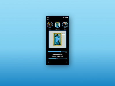
Daily UI Challenge #9
For this one I tried to limit myself from adding extra colors or shades, because if you are displaying album art on a music player that will add loads of different colors and I didn't want it to conflict.
Thanks for taking a look, love to hear any comment, thoughts, etc...
Fonts used:
Futura
More by Andrew Koss View profile
Like
