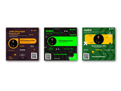
Memphis Style Webinar Instagram Feed Design #3
Doing some experiment using kinda neoin-ish for the ornament, and pretty dark color for the background on every design for this webinar flyer design...
Im also doing some experiment exploring the memphis style design with the geometric shapes here..
What do you guys think about it?
Does the color sync pretty well?
Or it doesnt fit at all or just pain in the eyes?
let me know :)
contact:
albarikemal@gmail.com
More by Albaari Kemal View profile
Like
