Seattle Kraken
The waiting game on NHL Seattle releasing their name has been making all us hockey fans itch. With the NHL announcing return to play in July i figured I would drop a concept i spent a very long time refining.
The Seattle Kraken, which is supposed to be at the front running in name contention for the Seattle Hockey expansion team, I designed this team brand kit with their city colors in mind. Their two existing pro sports teams all have similar color pallets. Why not make the Kraken mesh with the already existing cohesion. They'd be the only city to have 3 professional teams share a similar color palette.
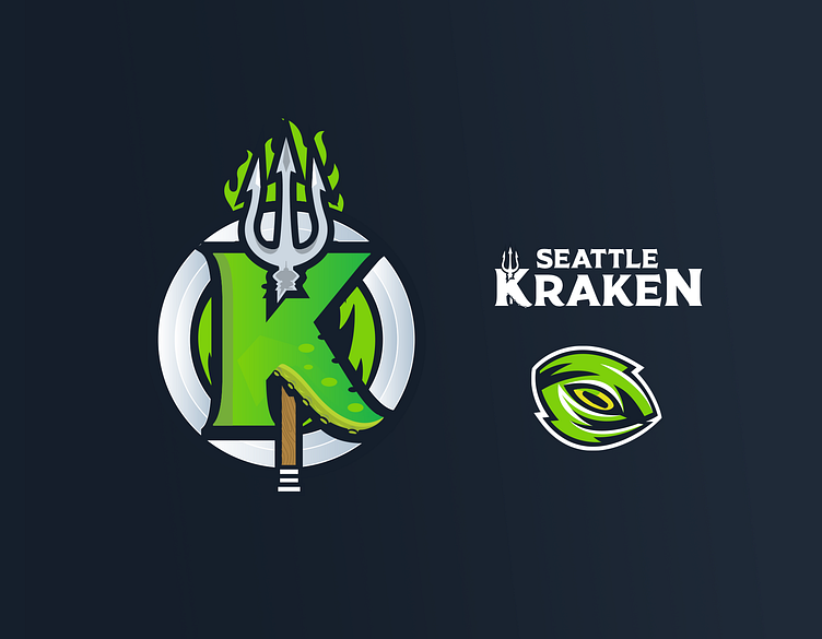
Primary Logo Mark: Release the Kraken Takes inspiration from Shipping and city sports history. A Trident harpooning the Kraken K. Hidden in the shadow you can see a recognizable city icon. The Space Needle.
Secondary Logo Mark: The Kraken Eye. Nothing is more iconic in paintings and movies about nautical Kraken encounters than the Kraken eye. Its a haunting reminder of the Krakens' power. Turning this iconic mark into an eye of the storm is the perfect way to incorporate this otherwise abstract element into the core of the teams spirit. Hidden in the mark you can even seen team abbreviation lettering.
The Iconic Work Mark: A tame version of the brand word mark with custom lettering that matches the primary word mark. This can be used in applications such as on air, in stadium, and in the press.
Enjoy
