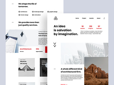
Architecture Landing Page
Hello folks,
Here is a architecture website exploration. I tried a few experiments with different layouts and typography. Dark color schemes are representing a clean and minimalist atmosphere.
Press "L to show your Love <3
Have any feedback? Feel free to share.
Cheers!
More by Ehan® View profile
Like
