Unused Concept - Process Interactive
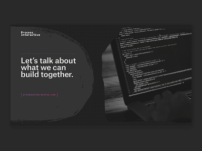
Unused concept for an identity exploration in progress for our friend and web development partner at Process Interactive.
Moving into specific touchpoints, the flowchart symbols appear next to each other—flowing from one to the next to imply movement through the process. They're all grounded on a fine dot grid to avoid feeling too organic. And it was important that they were flexible and had purpose, sometimes containing images or text.
More by Nonfiction View profile
Like


