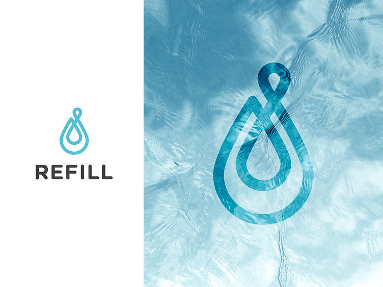
Refill
1 Hour Logo Challenge #17 Refill
Being a social enterprise that specialises in eco-friendly drinkware, Refill commits 25% of their income to helping charities🚰
Inspired by the brand’s sustainability – from its reusable product to its commitment of giving back – I designed the logo mark with loops in mind to represent the unending cycle, as implied by the brand name.
Hitesh was first impressed with the presentation. Overall, the logo felt nice and smooth for him which he thought represented the brand well. He would personally try having a human element in the logo as the business technically goes back to the society.
How would you design this one if given the challenge? This has got to be one of my favourites to design in the whole series! 🙌
More by Celia Fransisca View profile
Like

