Concept art for Optics 2.0

Logo for optics store in Moscow Region needs to be easy to read and understand. Minimalistic logo successfully used on the signboard later did it's job leading more customers then ever before.
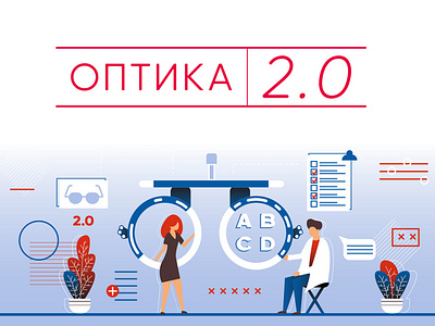
But if we talking about web site or social media it's looking "cheap" and "empty". That's why we desided to create series of illustrations. Lucky flat art suited for our task perfectly! You can see one of the pictures we made.
This is the first of my shots so i'd be glad to see ur comments!