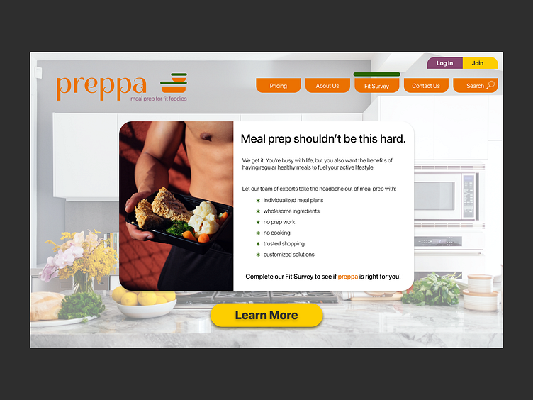
Daily UI Challenge #003: Landing Page
Starting with the basic idea of Food Prep As A Service (FPaaS), I found some stock imagery (credits to: Jason Briscoe and Mike Von at unsplash), then found an icon at the noun project for the logo (credit to MHD AZMI DWIPRANATA), which I stylized to match the page elements.
The menus are supposed to look like the 'bowl' from the logo, and the green 'lid' would indicate which page you're on. Purple was one of my secondary color choices and I used it for the tagline and login button only. Green was another secondary and I used it for the lids and asterisks only. I wanted the yellow to be my CTA color, and used it for both the 'learn more' button as well as the 'join' button, presuming either button would take the user to the same place.
In my opinion I do not love the card - it seems a little out of place. I think it's because I was trying to fit the entire idea of the site into one space. Next time I will design the landing page BELOW THE FOLD as well!
