Bad Typographer
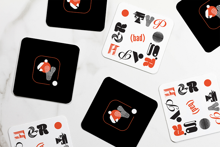
(WIP) I had a spec idea for a bar called "The Bad Typographer" where all the drinks would be matched to design movements. The idea has evolved to a social club for designers of all levels, changing the connotation of the word "bad". The overall branding is purposefully bad and good, echoing the evolution of our individual design paths themselves. The reverse of the coaster (black) included the small mark, which, instead of containing a B & T has the letter Y and question mark in hopes of prompting questions that begin with "why"—"why is this the small mark?" "what type of design you do?" "why does design matter?"
