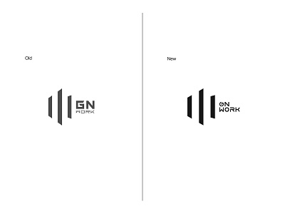
GN work team logo image upgrade
GN work team is a group of architecture-loving players who come together to research and communicate, using a sandbox game called Minecraft as a Carrier to unleash love and passion for architecture and life. In today's ever-expanding world of influence, teams are also maturing and need to get rid of old images and let brand new and mature visual images enter In heart of masses.
Logo only font redesigned to retain the original pattern and understated and stable atmosphere well maintain a stable continuity. New version adopts a unified, clean-looking, neat layout. "G" letter is slanted upwards the design of , reflect the team's confident attitude and adding personality and ductility.
GN Work团队是由一群热爱建筑的玩家聚集在一起研究与交流的团体,以一款名叫Minecraft的沙盒游戏作为载体释放对建筑和生活的热爱与激情。在影响力不断扩大的今天团队也逐渐成熟需要摆脱旧形象让全新成熟的视觉形象进入群众心中。
logo仅对字体进行了重新设计保留原来的图案和低调稳重的气质,好维持稳定的延续性。新版采用统一,让人看着干净、整齐的布局。“G”字母倾斜向上的设计体现团队自信的态度又给字体添加个性和延展性。
Detailed:https://www.behance.net/gallery/97775463/GN-work-team-logo-image-upgrade
