More Comments
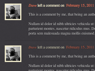
I've lightened the colour and tried a text shadow on the meta which matches the comment content. Here we have the same lighter colour, above without the shadow and below with the shadow.
I've noticed that not only does the shadowless version appear lighter in colour, it also looks significantly bolder. This is in Chrome though and Webkit antialiasing hasn't been applied yet.
Is this any better? If so, which one looks better on your display? It may be different to what I'm seeing as the previous shot wasn't bergundy on my screen but a pretty mid-range red. Maybe time to calibrate.