Dash 2
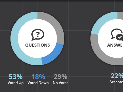
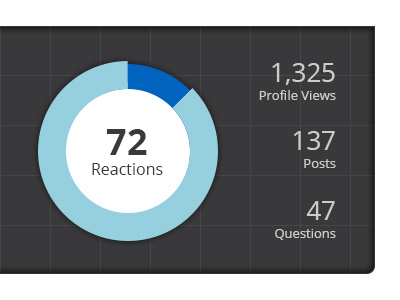
Trying to improve on previously posted dashboard to be more engaging and easily understandable. Previously, you had to mouse over the sections of the graph to see what they represented, and just having the totals in the middle was a bit confusing without explanation.
More by Rob Schlegel View profile
Like

