Fraktine Typographic Specimen


Last slides of Fraktine's Typographic Specimen. Swipe for more!
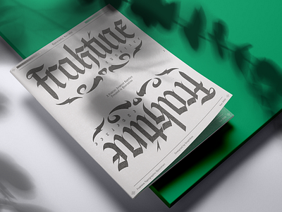
I went through a round of fine-tuning across the document and introduced a green as part of the visual language.
Here’s why I made that decision: Fraktine was drawn during Quarantine. It is an organic, sharp, condensed, and decorative typeface. It was meant to inspire hope for better days, beauty amidst chaos. Green felt like an appropriate color, knowing that it is the color of hope, nature, hence revival.
And it looks quite cool so...
I hope you’ll like it!
Have a good one folks ✌