"Audioteka" app redesign


Howdy! 💙💙💙
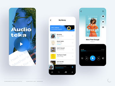
“Audioteka” app is the most popular Lithuanian audiobooks app and also my first UI/UX redesign case in my project “Purposeful practice UI/UX”. 🎧📚
Since I’m the target user of the product and a fan of similar apps, as a UI/UX specialist I observed some missing functionalities that would make the experience even better. After observing some problems, I've made a research (competitor analysis, user persona clarification, brand field analysis, social network research, UX heuristic evaluation) and then created the hypothesis and the final design solution/prototype.
I focused new app redesign on the main purposes:
1. Screens/functionalities for busy people. I redesigned the main screens putting more focus on the clearness of book listening controls/player. The play/pause button is brighter, the contrast in control panel higher, backward/forward 30s functionalities added, driving screen added, increased usage of icons instead of text labels, etc.
2. Modern app look & feel for the modern user. I redesigned app visual style, made it up-to-date, cleaner, put more color contrast, added book cover gradient branding so that every book had unique visual sense. Since the target user of the app is modern and busy, looking for new inspiring information, the app also aligns its visual branding translating the new modern way of reading books.
I hope you like it! 💙