Bepn

Concept: “Explore the universe”.
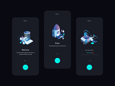
I decided to create a story helped by bought illustrations from Pixels True Design, that narrate the story of an austronaut exploring the universe. This conceptual idea gave life to my color palette, interactions, illustrations, and more.
Illustrations:
The isometric-tech illustrations are used to help the concept of exploring.The user is the astronaut, and he will be exploring the universe of flags by dragging around the map to choose the perfect location.
Icons:
The icons follow the same style as the rest of the navigation button which is a linear and cyan stroke. This way the navigation button is not as heavy for the eye and helps to point direction to our main focus: the start/stop button.
The design of the navigation bar is simulated to be the inside of a spaceship with the window to the universe.
Main button:
It was considered always to be the primary action and the most visually to the eye to scan because it does the most important task: to connect, which is the whole idea of a VPN app. By situating it in the bottom center, it is easier for the user to reach it because of Fitt’s Law: “The bigger an object is and the closer it is to us, the easier it will be for us to reach it”
Choosing countries:
The main interaction besides connecting to a server is also choosing it. This is why I wanted to create something fun and keeping far from a classic dropdown. Sticking to my main concept which is exploring the universe, I made my user to literally explore it through the stars by creating a network of flags. The user can either filter it by having the settings to: around me, best connection, random and more. The user to interact with the map will have to tap around the flags, he can make the flags smaller or bigger and can explore through out the other continents.
To see more of this project go to my case study in my portfolio: https://www.sierrabravodesign.com/bepn