Calculator Icon Redesign Concept
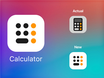
The Calculator in iOS is very useful and the icon is simple and communicates very well what it is for, but we already know that design, so to make it simpler I removed the background and the screen and just leave the keys in a larger size, respecting the guidelines of the Apple icons to look much simpler and modern.
Simple and minimalistic redesign of the Apple Calculator Icon.
This is the third icon of the series "Icon Redesign", check my other concepts on my Dribbble page.
The objective is to achieve a well-looking design, but making everything more minimalistic and modern without losing the concept of the previous icon.