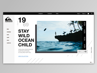
QuickSilver - Web Design Exploration
🌊🌊Today I'm sharing a design concept exproation I worked on and it’s so special to me as Quicksilver is one of my favorite brands growing up and inspires me in so many ways.
The redesign refreshes the look and feel of the site with some small UX tweaks to add interesting, engaging and modern yet minimal touch to the site.
The the redesign targets the landing page of the site by adding minimal, refreshing banners, homepage imagery and headlines with a super easy navigation system to drive the traffic to know more about the brand and the products.
Another part of the redesign exploration is the Showcase Page by enhancing the over-all look and feel boosting the clarity of the product page to help focusing mostly on the experience. 🚀
.
.
.
.
.
What you think of the color palette ? .
.
Join my journey in App Design 🙌
@byessam
