30 Days of Art: (7) Grid Systems Analysis


The next three days for me are gonna be super busy, as I have a project due this Tuesday that I need time to work on. Therefore, the next three UI pieces will be super simple - or so I hope. I tend to overthink and come up with really complicated ideas that I can't design in the end, making me frustrated cause I wasted so much time trying to draw a vector without getting any sharp edges or properly making an animated or interactive prototype 🤦🏻♀️
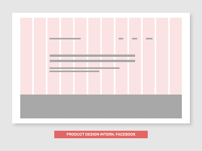
Today is a grid systems analysis of various intern website portfolios of those working or have worked in top tech companies, including Facebook, Google, and Microsoft. I gathered a select few portfolios from Cofolios.
Why did I pick these ones specifically? I noticed many UX/UI, Product, or overall design portfolios tend to bear similarities - having a navigation at the top, a short description of who they are, and their top portfolio pieces to showcase. They all use very common Google Fonts for their headings and body copy (eg. Roboto, Open Sans, PT Serif, Libre Baskerville). They have the same four or five pages - Home, About, Work, maybe a Blog, and Contact. Even though they are all very similar (where is the branding & identity here???), are they taking into consideration, a grid system to align and place their elements to establish a hierarchy and structure? If their elements seem to be displayed neatly, are they truly lined up in an organizable manner? I wanted to see by analyzing their homepages using a 12-column grid system by a 1280x800 resolution, if they are all clones, or if some of them happen to bear some semblance or uniqueness.
I'm still using my almost 10 year old 13-inch Macbook Pro in case you're wondering why the resolution I chose is weird... but hey, my Macbook still works perfectly, thanks to keeping it in pristine condition!