GQ Magazine Logo Redesign
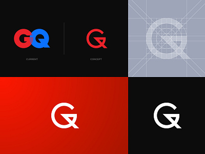
Here's a bit of my concept. eventho the original logo may be a bit fancy to some, it's just not my style. I tried to combine the two letters of the logo in one mark and I did find it well easier to look at.
Happy to hear your thoughts!