Daily UI :: 005
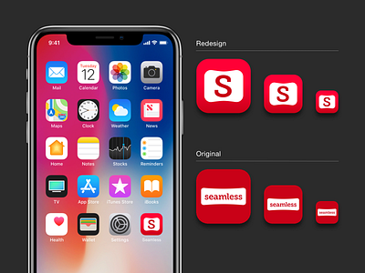
For this app icon challenge from Daily UI, I thought i'd redesign food delivery Seamless's app icon. I simplified their design because their original one felt too cramped and had poor legibility because of the full word "seamless" crammed into the app icon. Then, I added a gradient to the icon to give it more depth - vs the original that was rather flat.
More by Karen Chang View profile
Like
