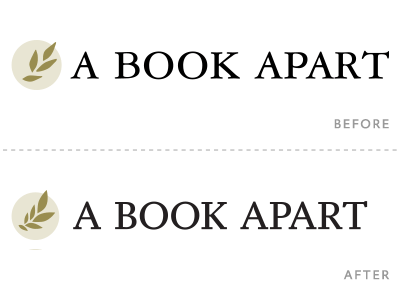
A Book Apart logo redux, in progress
As part of a revamp of the A Book Apart paperbacks, I thought it would be a good time to touch up the ABA logo.
As the different Apart entities have grown to stand more on their own, all the logos that used to be basically identical have now also grown into more distinct marks. So, I wanted to leave behind the vestiges of the old mark—which was derived from the old A List Apart logo—and give it its own voice.
Here are the old and new logos for comparison. The new logo uses Yoga (our body text typeface) and sports a cleaner laurel branch.
Logos really aren't my forte, so it takes me a long time to get at something decent. Case it point, I redrew the branches and leaves many many times. Attached is a screenshot of some of those.
More by Jason Santa Maria View profile
Like

