et results.
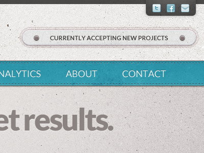
The asymmetry of the original status line was begging for balance. Also, the look and placement of the original resembled a search field. Now it pops out! It pops! Out! Make my logo bigger.
Update: This went live in March.
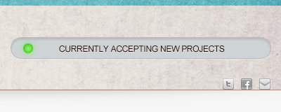
The asymmetry of the original status line was begging for balance. Also, the look and placement of the original resembled a search field. Now it pops out! It pops! Out! Make my logo bigger.
Update: This went live in March.