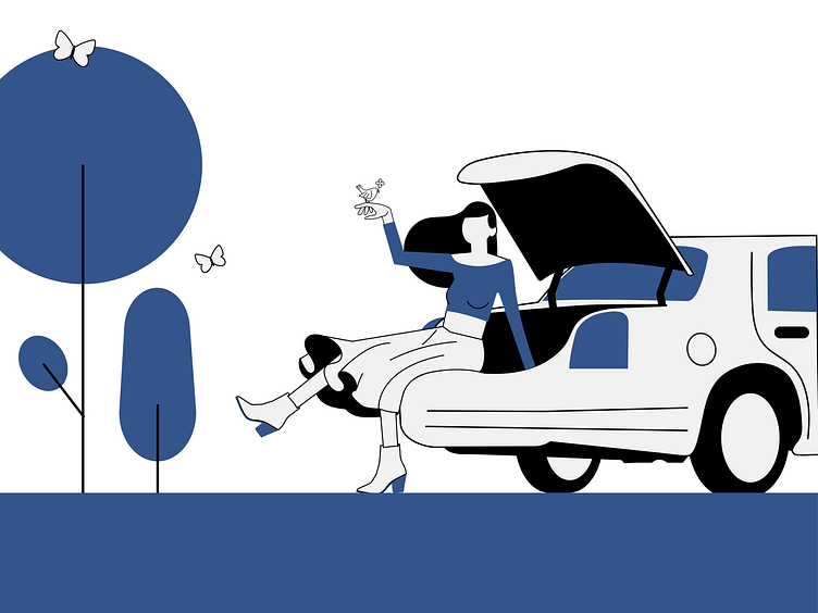
Easy day
This piece is a part of a bigger artwork that will be soon animated. But I really liked this part, so as a preview of a whole.
The style is inspired by Timon Kuilder aka Zwarte Koffie. I'm amazed about his consistency of work of using simple shapes and lines to tell a story. Though I'm quite fond of "less is more", its hard for me to apply it to in my "style/work". Again, a good practice!
As for the colors I applied a monochrome colorpallete, including the pantone color of the year; classic blue! For the process: https://www.behance.net/gallery/99769559/Quarantaine-days
More by Didi Xie View profile
Like
