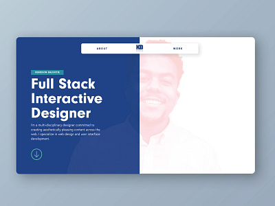
Kenrison Balootje Website Design
Hey Everyone! 👋
I recently designed a clean portfolio website showcasing my current skills and services while establishing my personal brand.
I was inspired to design based on a mainly blue color scheme and sans serif fonts, and ample use of white space for contrast. These colors and fonts are combined to establish the basic look of my Kenrison Balootje brand. A clean, diverse, and trustworthy brand.
🌟 Bonus feature: Translation of the whole site into Spanish activated with the click of a button (translated and developed by myself).
Motion Design: AE
UI/UX: Illustrator
Development: Webflow
**************************
🔥Take a closer look at the live site today!
https://kenrisonbalootje.webflow.io/
Appreciate the ♥️ and follows.
More by Kenrison Balootje View profile
Like
