Unused Concept - TowerCo Cellular Carrier Brochure


Unused work for TowerCo.
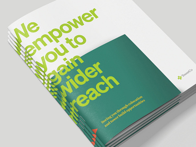
With target audiences clearly split into three distinct groups, we needed to approach each with a different message, and with a slightly varied, but consistent visual approach.
I started to use similar elements—the dot grid that represents TowerCo's network of towers, and shapes derived from their logo at a different scale for each audience. Carriers operate at a high level, dealing with entire regions of clients at a time, so the pattern gets very detailed.
In the brochure interior, we used clever copywriting to showcase their main selling point: their simple process in an industry that can get very complex.