Progress bar
UI challenge #86 - Progress Bar
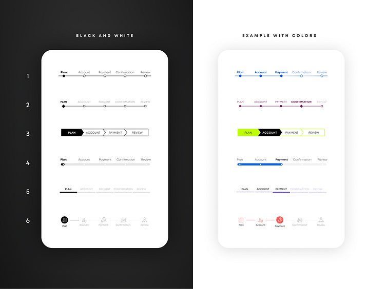
The screenshot presents 6 different styles of a checkout progress bar.
On the first screen I wanted to focus on designing the first step in a black and white version. Why black and white? In this way I could focus on design hierarchy without relying on the color.
The second screen shows what happens when the user is in the middle of the process. I also added some color to push visual interest further.
Not every design may work, but it was my way of exploring it.
Icons by: Freepik, Icongeek26, and flaticon.com